As part of the Design Heritage Platform,
model viewer (aka. model editor) is the place where user inspect and edit the 3D model they have uploaded.
While primarily showing a 3D scene, the model viewer has far less functionalities compared with storyboard (aka. story editor), which makes it a good place to teach new users the basics of 3D scenes. Therefore, we centered redesign process around the following design question:
How to introduce basic concept and manipulations of web-based 3D scenes to new users?
The original model viewer was coded as a proof of concept without much design considerations; therefore, it has many limitations, especially as the platform evolves:
- Introduce the basics of 3D scenes to new users
- Provide a more intuitive process to manipulate models and cameras
- Integrate the upload functions to create better work flow
- Convert the page to Vue.js and upgrade the user interface
Before started designing, I looked at the interface design of a series of applications that share similarities with the Design Heritage Platform or its model viewer.
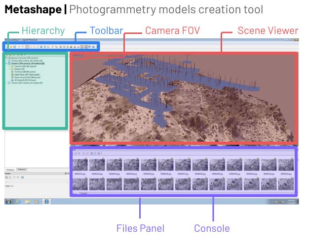
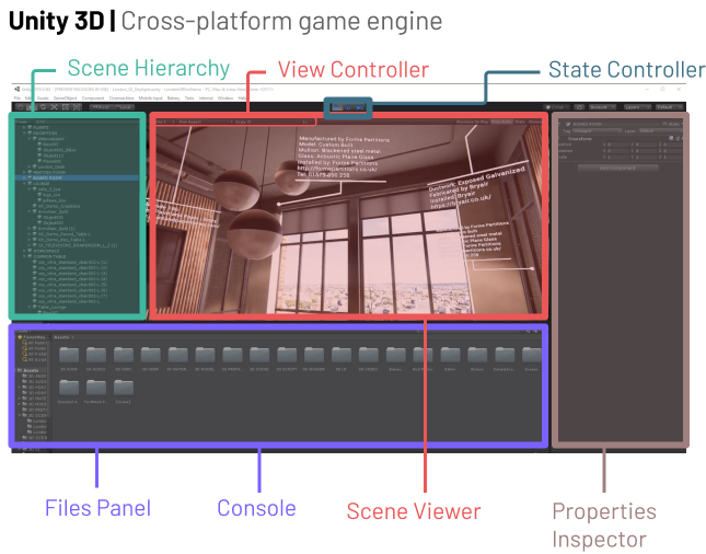
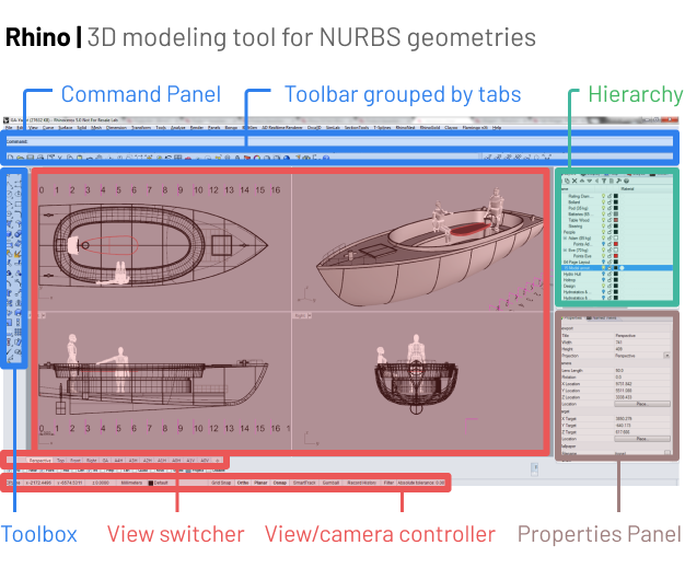
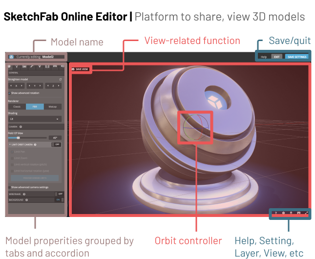
The key takeaways are:
- Scene view always takes up most of the screen
- Axis and orbit are standard elements of a 3D scene but doesn’t need to show all the time
- View setting or camera setting is always shown on or near the scene view
- Toolbox or editing panel is always located on the top or left of the view while properties panel is always on the right
- More advanced tools always provides user great flexibility to rearrange their view
In additional to using them for inspirations, I also choose those tools because some of them are what our target users use in their daily life or as part of their workflow of creating and editing models. Since they are already familiar with those interfaces, a similar layout will effective smooth their learning curve when they start to use the design heritage platform.
Based on the previous study, I came up with this wireframe to get the team's alignment first. The whole page is breaking down into five sections:
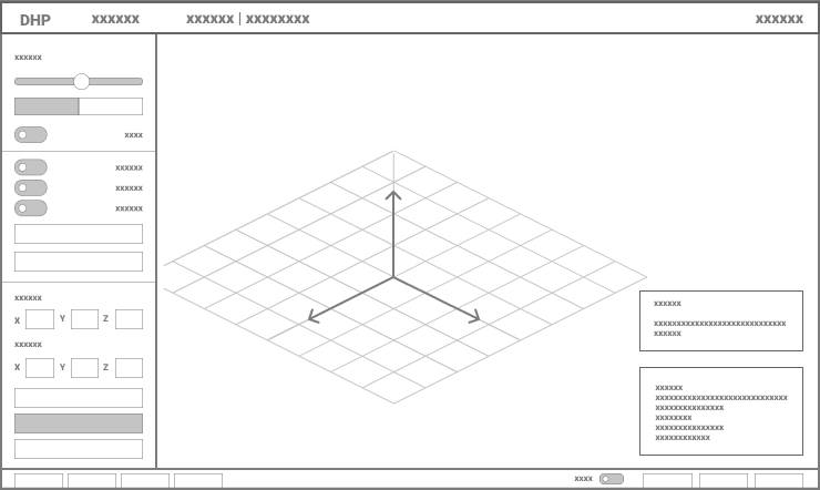
- 3d scene, with its origin and axis being visualized
- the navigation bar
- Sidebar that contains all editing functions, divided into sections
- view controls at the bottom
- two floating panel for instructions and model properties
Please click on the text buttons below to view each iterative step:
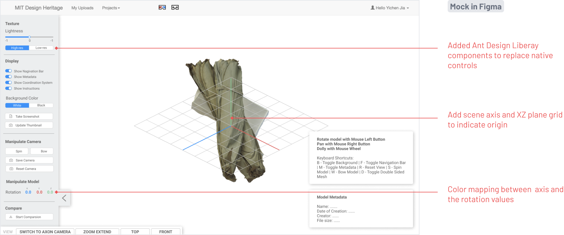
Labelled axis, orbit, view target
We visualized a series of standard components such as axis and orbit to teach users the basics of 3D scene. We also added view target to illustrate how “rotate around view center” works, which is what confuses users a lot previously.
Functions fix model and camera orientation
One major complains we’ve heard from users is that they always had trouble orienting their model generated by certain modeling tools. We added helper functions help that scenario.
Present mode
Present mode allows user to quickly hide all the panels, which comes in handy when they just want to showcase their model. We also added functions like auto rotate and set background color to further facilitate users’ presentation need.
Integrated Upload Workflow
We decide to combine upload page into model viewer to further simplify the flow of uploading a new model. By doing so, user could re-orient their models with all the powerful functions available in model viewer during uploading.