A Slice of MoMA is an interactive data visualization of the Museum of Modern Art’s online collection. It proposes a playful way of visualizing a large amount of artwork data by approaching them from a color analysis perspective. It stimulates visitors to explore and compare artists, reveals the color progression of their artworks, and recommends artworks of similar visual styles based on visitors interests.
2019.5
Jialu Tan
Design
Arvind Satyanarayan
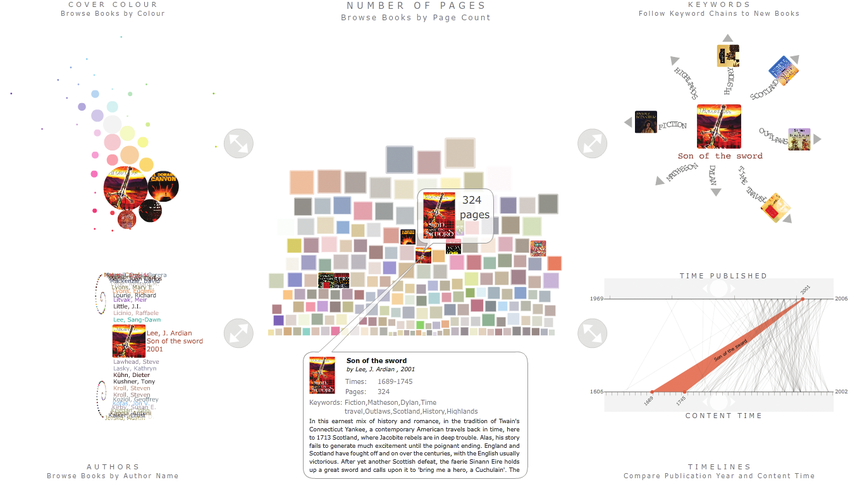
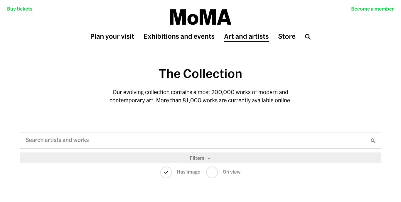 MoMA's Current Website: https://www.moma.org/collection/
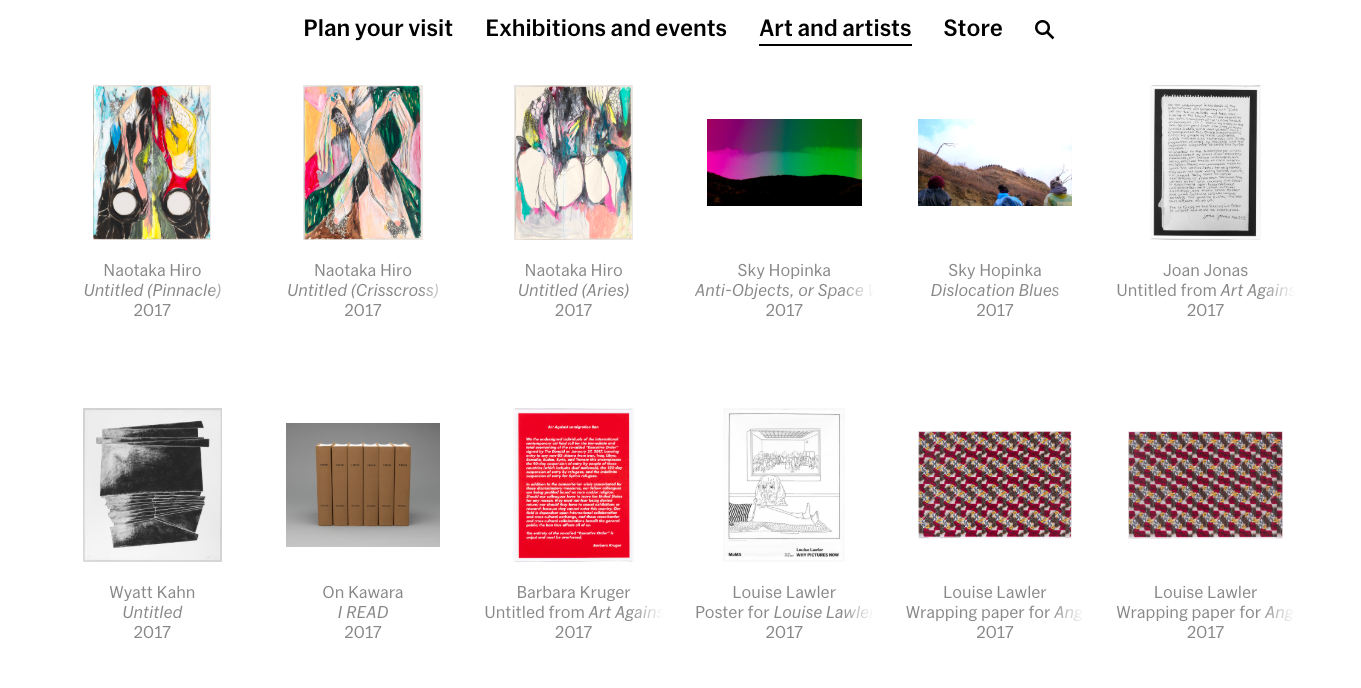 MoMA's Current Website: https://www.moma.org/collection/
- It is mainly designed for professionals who know exactly what they want to search for
- It does not give a good overview of MoMA’s digital collection
- Make MoMA’s online collection more accessible to people who don’t have much background knowledge about modern art
- Transform the traditional way of displaying artworks online to an inspirational exploration tour
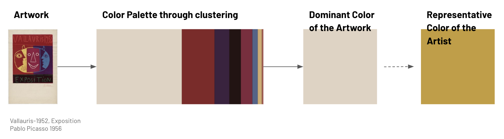
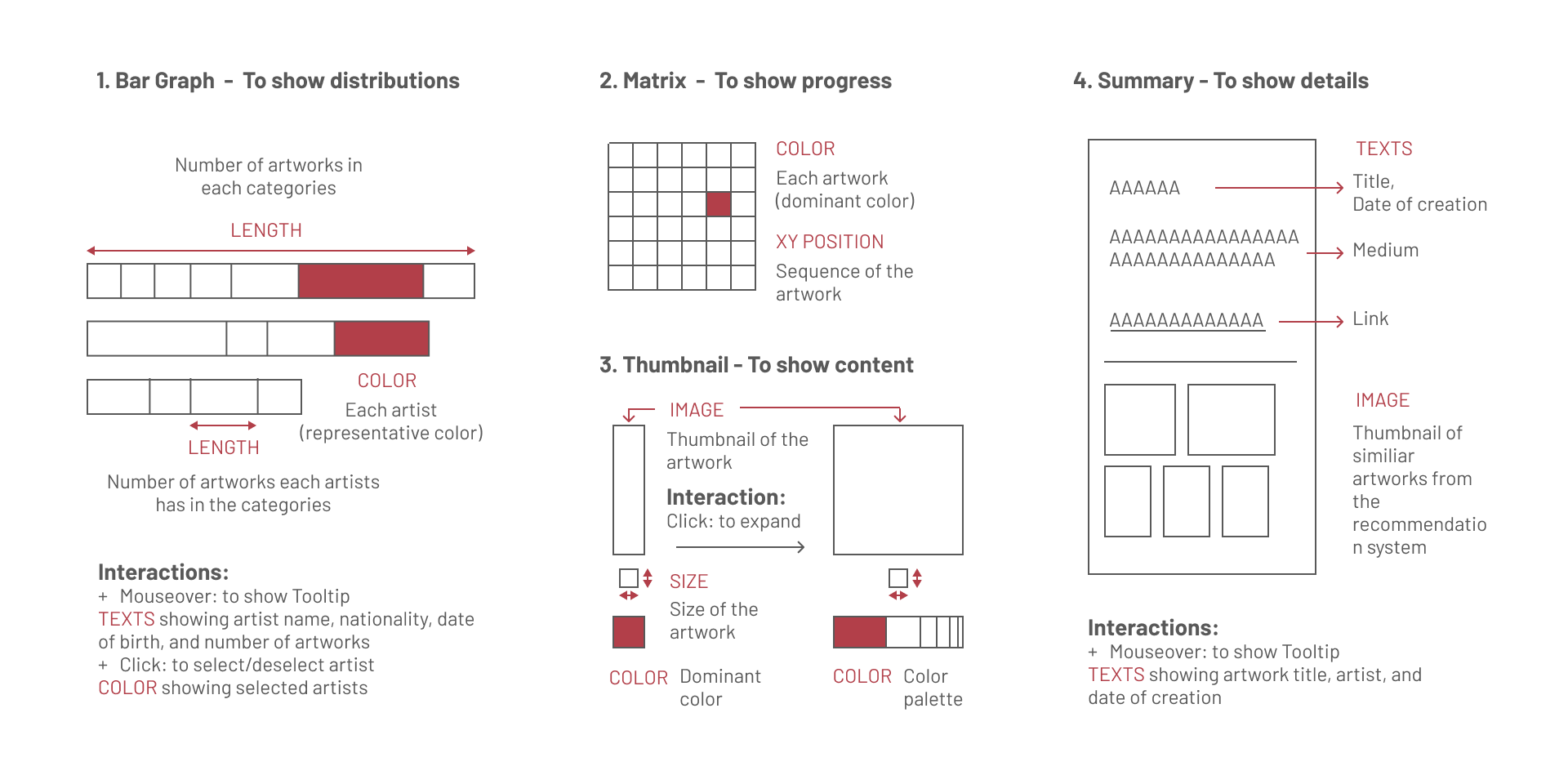
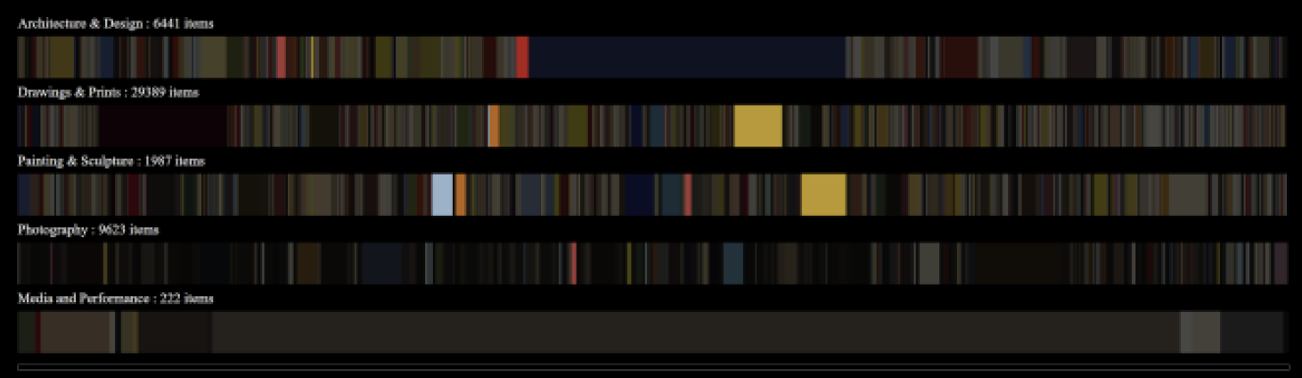
Color is something easy to understand and people can associate themselves with. It is also something that grabs people’s attention when during first encountering. Therefore, we’ve explored different methods to extract the color information from the artwork, and use that to direct the whole experience.
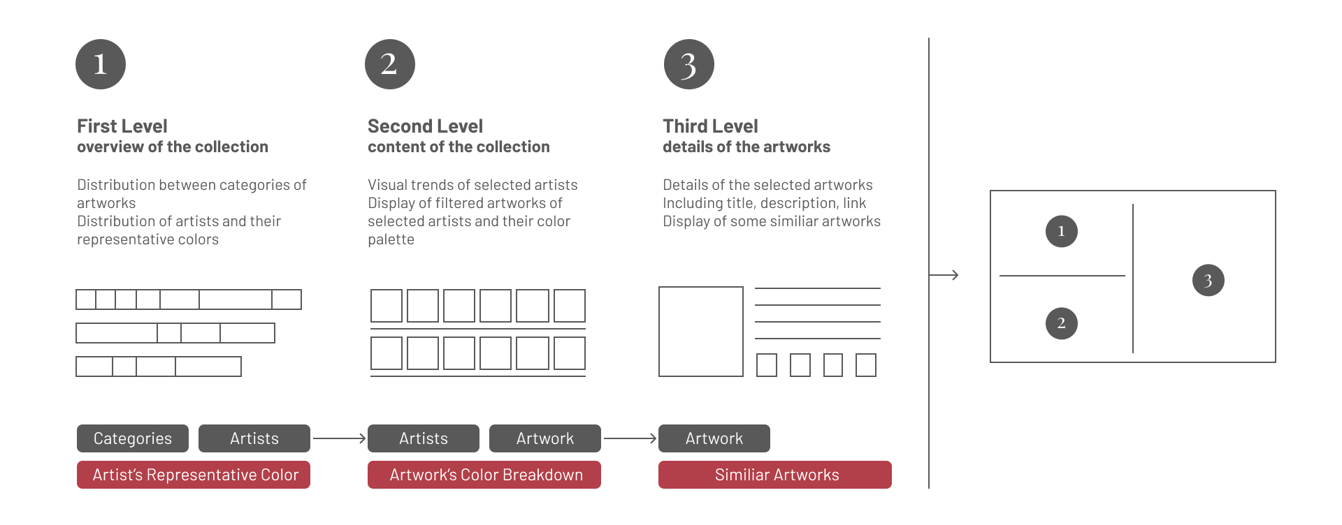
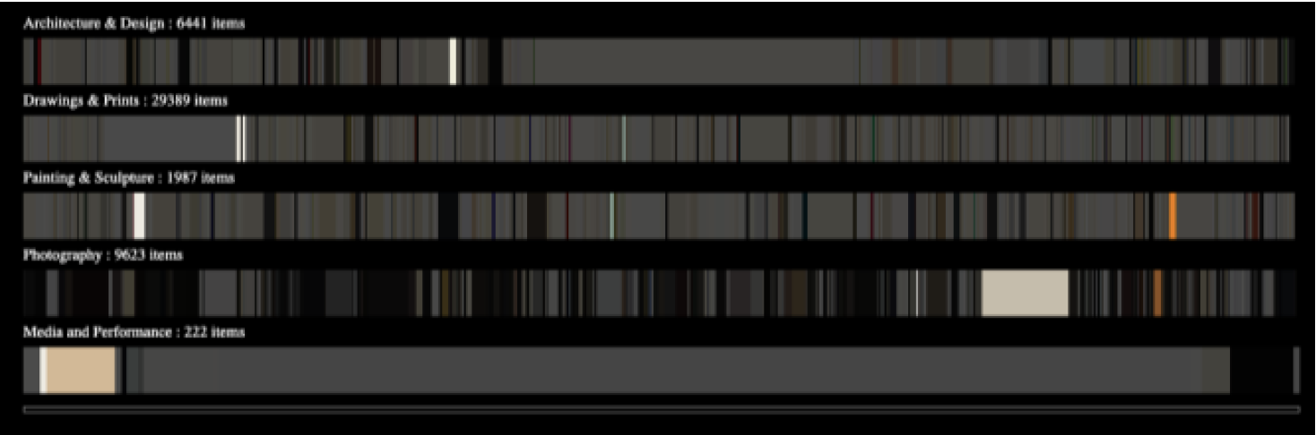
We were dealing with a large dataset that have 80,000+ entries of artworks and 10000+ entries of artists. In order to show both high-level overview as well as details of each piece, we’ve looked into ways to break down the exploration into a step-by-step process, with each step revealing a bit more information.
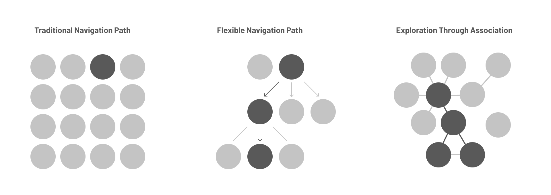
Last but not least, we want to avoid the traditional way of display artworks in a grid layout, but allow user to have a flexible path of navigation based on their interests. We wish user would be able to explore artworks through association instead of indexing, which led us to build an artwork recommendation system powered by machine learning.
Bohemian Bookshelf
The Bohemian Bookshelf is a bookshelf visualization that was designed to facilitate open-ended exploration of digital library collections and serendipitous book discoveries.
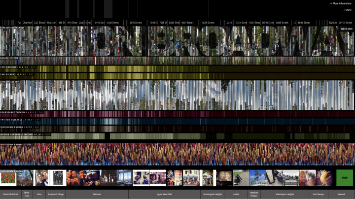
On Broadway
On Broadway folds Google street view maps and Instagram posts of street segments as slices. Users can click to expand the whole images and see more details.
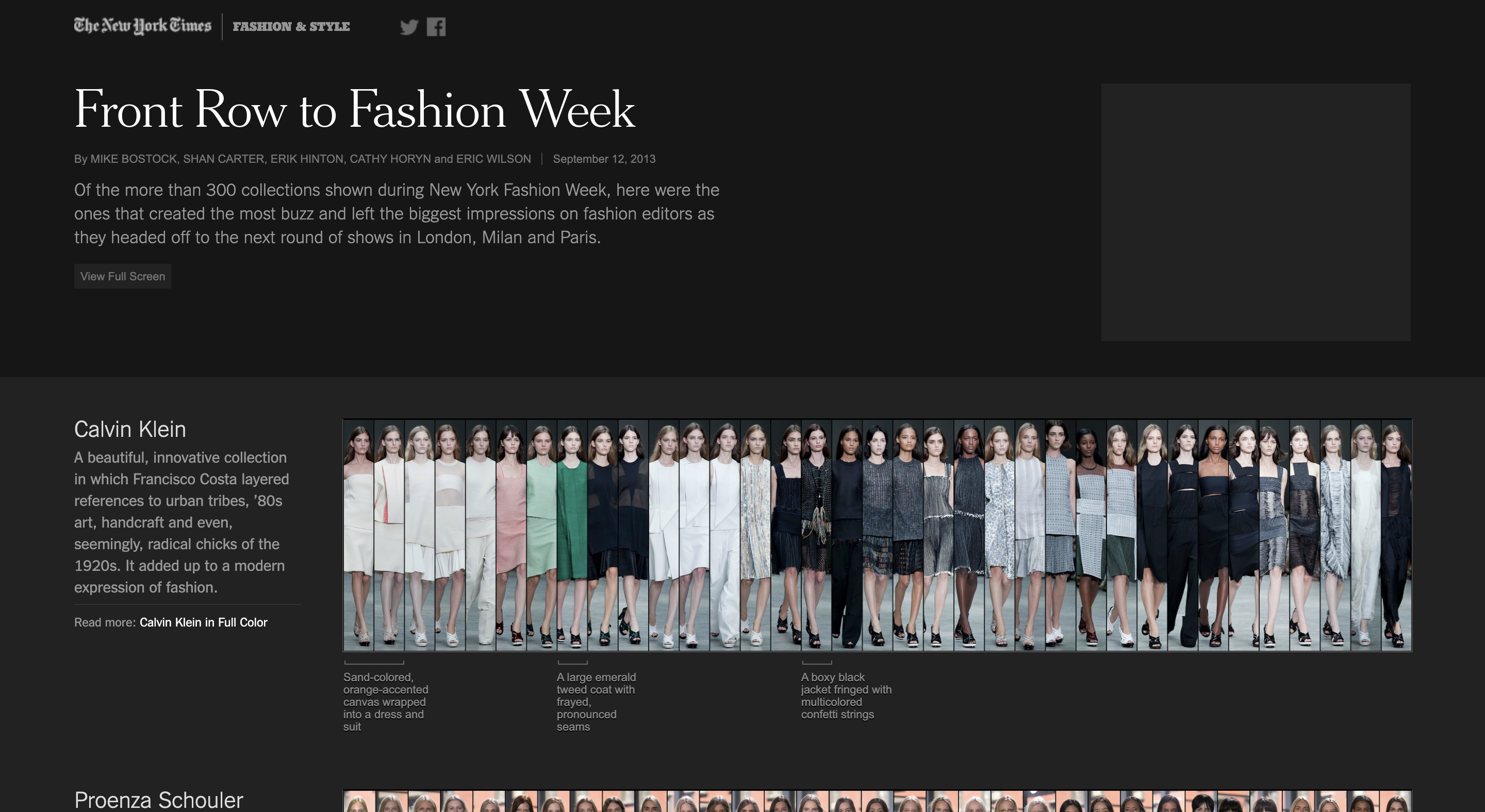
Front Row to Fashion Week
In this visualization created for 2013 New York Fashion Week, dazzling collections were presented in carousels (one for each designer). All images are really thin, only showing a glimpse of the main colors of the outfit until user mouseover it.
 Meanwhile, we also started to making hand sketches as well as mockups in Illustrator.
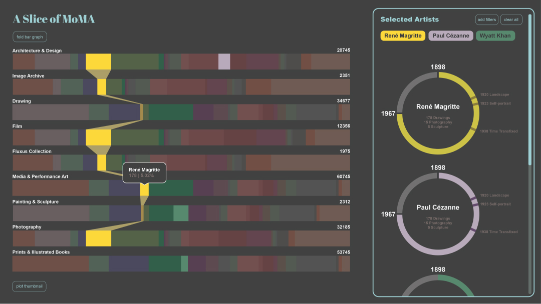
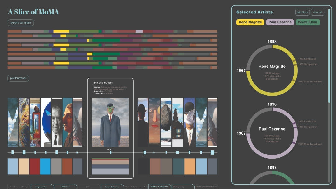
Please feel free to play with our live prototype, which we coded from scratch with HTML/CSS, JavaScript, using D3.js and Boothstrap. Please note the prototype only works for desktop.
If you are on mobile, please feel free to check out this demo video
A Slice of MoMA is our first attempt to explore the concept of online museum and displaying artwork datasets in a more exploratory and interactive way. Working on it as the final project of a data-visualization class, we had to prioritize tasks within the limited timeframe. If we had more time and resources to work on this project, I wish we had:
- send out survey in the beginning to better understand what people want when they browse art museum’s digital collection, and run usability tests after we build our prototype
- take responsiveness and accessibility into considerations
- utilize existing JavaScript UI frameworks to build the prototype more efficiently